http://www.truth-out.org/three-charts-email-your-right-wing-brother-law/1314626142
Monday 29 August 2011
by: Dave Johnson
Government spending increased dramatically under Bush. It has not increased much under Obama. Note that this chart does not reflect any spending cuts resulting from deficit-cutting deals.
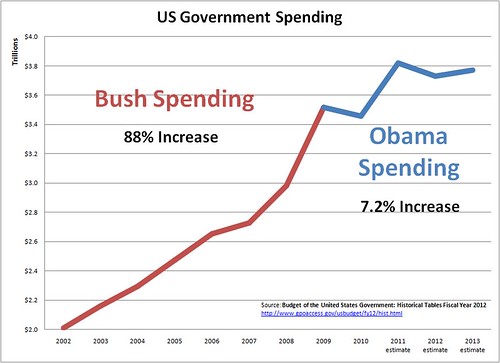
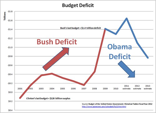
Notes, the following chart includes Clinton's last budget year for comparison.
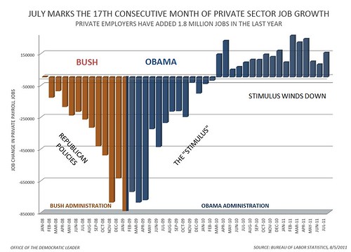
In this chart, the RED lines on the left side -- the ones that keep doing DOWN -- show what happened to jobs under the policies of Bush and the Republicans. We were losing lots and lots of jobs every month, and it was getting worse and worse. The BLUE lines -- the ones that just go UP -- show what happened to jobs when the stimulus was in effect. We stopped losing jobs and started gaining jobs, and it was getting better and better. The leveling off on the right side of the chart shows what happened as the stimulus started to wind down: job creation leveled off at too low a level.
[...]
These things really matter. We all want to fix the terrible problems the country has. But it is so important to know just what the problems are before you decide how to fix them. Otherwise the things you do to try to solve those problems might just make them worse. If you get tricked into thinking that Obama has made things worse and that we should go back to what we were doing before Obama -- tax cuts for the rich, giving giant corporations and Wall Street everything they want -- when those are the things that caused the problems in the first place, then we will be in real trouble.
..

No comments:
Post a Comment